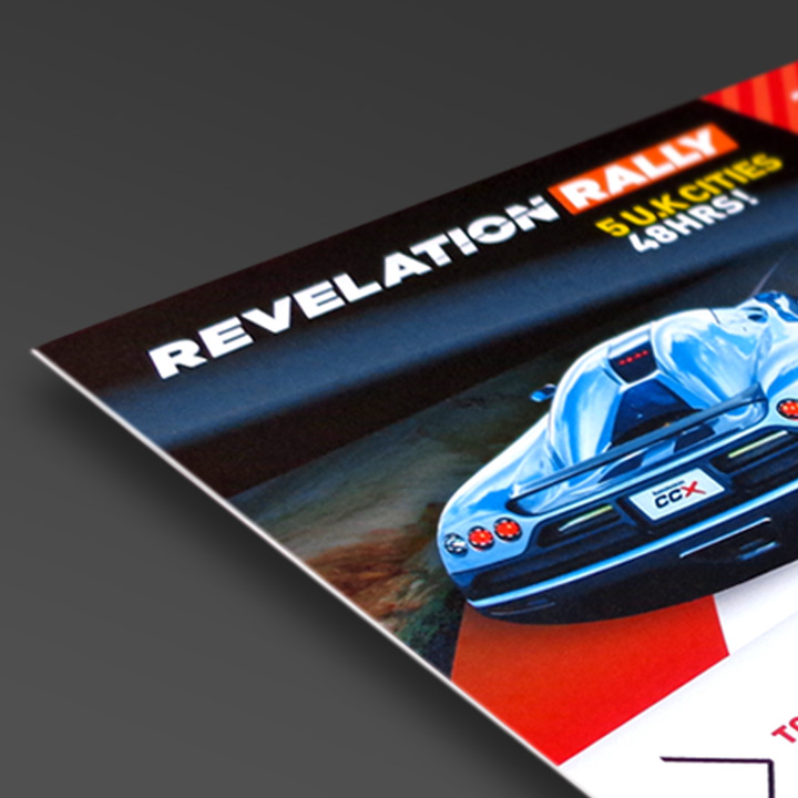
Useful Tips on Planning Advertising Space, Design and Content
Preparation & Planning Your Area
Before planning or passing your content to a design agency review the space you are buying and have a clear idea of the scale and dimensions of the area visually. Be aware of the format/orientation of the space (landscape or portrait) as this may impact on your image choices and overall layout flexibility.
Space is a premium within advertising not just in terms of cost but in the way it communicates. A design agency will typically be looking to divide your content into sections of importance. The areas below demonstrate what these are and may help you save on revision and build time when planning your initial content.
Consider the surroundings and typical competition of the advert. Adopting a contrasting overall colour or reducing the amount of white space within your advert may help create a natural focus or preference within the overall page. Think cleanly and simply with an uncluttered approach as tense crowded content can affect the way your company’s capabilities are perceived.
Ask for a sample of the publication so you can review the stock material it is printed on. Most magazines will use a coated stock that will hold solid and strong colours well. ‘Newsprint’ as used in newspapers however is a low grade and off white material. Large overall areas of colour can appear dark and murky and bright colours reduced or with a shift in colour. The overall appearance of newsprint is a much more muted/recycled feel so carefully consider your colour choices or study a sample with similar tones to those you intend to use.
Your Logo and Correct Application
Your company logo requires prominent placement in the advert but it is important to remember that even with recognised or established brands the company logo should be treated as ‘secondary’ content. As it is usually the product or service that you will be advertising it is key that this content receives effective available space in which to communicate. The logo should be used to reinforce the message but not overpower or consume valuable areas of the layout.
Establish whether your existing logo artwork is of suitable quality to pass on for inclusion within the design. EPS (vector based) formats are often preferred to work from and offer the most flexibility. Jpeg and Tiff type files are also acceptable though the files will need to be at a
resolution of 300 dpi and of suitable size. If your logo artwork does not meet some of these requirements or is not in a digital format it may need to be recreated during the production of the advert. This may be subject to additional costs.
‘Pictures Speak a Thousand Words’
It is often an overused statement but well-chosen imagery that supports your brand image will add contrast, interest and natural focus to your advert over pure text alone. Look to select imagery that has a good association to the palette of your brand and has content with some scale and drama. Use images boldly, if your content is minimal or if space permits an image could safely occupy 50% of your design. If you have source photography available use imagery that is consistent to other campaigns or literature. If you have no existing source material available to you it may be better to consider using a stock library such as
iStock or
Shutterstock where you can source high resolution quality material suitable for your subject matter.
Hone Your Text Content
It is a common mistake to try and say as much as possible in an attempt to add value to your statements or make the most of the available space. This approach has the opposite effect visually as the text will need to become smaller and on mass it loses focus compared to
short or bulleted sentences. Therefore if you want to create the most visual impact and stand out next to your competitor’s, short focussed statements are the way to go.
It is worth considering employing a word count when writing for media with fixed boundaries. A word count will limit unnecessary revisions and will help you produce more focussed content that captures the essence of your business or service.

if you want to create the most visual impact and stand out next to your competitor’s, short focussed statements are the way to go.
When planning and writing your content work in the same orientation as your advert design. Have a clear idea of the space your text content is occupying. Typically consider a campaign header (10 words or so max), a short descriptive para or three or four short bulleted items. With items such as these you can bring some scale to the header and format the body text or bullets smaller creating a natural hierarchy in the design and help draw the eye.
Call to Action
Establish a bold area that promotes a
‘call to action’ in response to your statements. Visually this should be stronger than the main text content or feature a divider or change in background. Don’t just provide a contact method that is suited to your convenience, potential clients may wish to first review your website or contact you via social media. If you have these options available offer varied methods of contact.


