Helpful Hints on Planning Content for the Design and Print of Flyers, Leaflets and Promo
Market Overview – Do I Still Need to Print Promotional Material?
Creating promotional material such as a Flyers, Leaflet or Postcards is still a very cost effective way of getting your message across a target/local audience. Although you may have considered an online advertising or social media campaign, printed media should be seen as a supporting element in a ‘catch all’ marketing strategy. Building brand image and loyalty is all about creating visibility and therefore recognition. If customers are exposed to your brand in a range of mediums it starts to generate trust and preference through familiarity.
Printed promotional material is more immediate. Granted the response (as with any advertising) will quickly be either positive or negative but it puts your campaign directly in front of your audience and is not reliant on customers finding you or deciding whether to visit an invite link.
A vastly competitive online print market, digital technology and more transparency in pricing have vastly reduced the costs in printing promotional material. In today’s market large runs that create wide coverage can be completed for a surprising low figure.
Planning Size, Format, Layout and Content
Size wise its best to think in industry ‘A’ sizes here.
Typical flyer and leaflet size is A5 (148mm x 210mm). Depending on your requirements you may wish to adopt a larger size say A4 or even A3 folded. You may also want to choose a less traditional format such as DL (99mm x 210mm) for an elegant slim look that for example may suit a menu or pricing structure. Postcards are normally A6 (105mm x 148mm) but again you could go for a larger A5 card or smaller A7 type.
Square formats could also be an option for all promotional material though it’s likely they may incur additional print costs. A4 squared (210mm x 210mm), A5 squared (148mm x 148mm) or A6 squared (105mm x105mm) may provide an alternative look if your content suits the layout space.

you have a very short window of attention and response time, therefore look to make your statements brief, punchy and focussed.
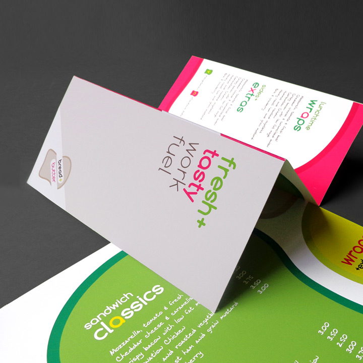
Decide whether your promo flyer, leaflet or card should be folded and if it needs to print single or double-sided. The difference in cost is very marginal. It may well be worth adopting a double-sided layout if your service or product relies on supporting or technical information. Even if your content is relatively minimal it is worth considering a double-sided format to create as much visual impact and have the flexibility of a larger overall layout area.
Effective communication is critical in promotional material, therefore your statements and content need to be considered appropriately. Spend time on this aspect, you have a very short window of attention and response time, therefore look to make your statements brief, punchy and focussed.
Consider a large opening campaign statement of around 10 words. This should encapsulate what you are selling and the immediate benefits/solution offered to your customers e.g ‘Need a cash loan fast?, look no further!’
Support your campaign statement with a short descriptive para or a range of succinct bullets. Don’t be tempted to waffle here. It is a common error to think that adding detail adds value but leave that to the second stage of contact. Again keep in mind the response time of your recipient, you have a couple of seconds if they can’t read and process your statements in that time you have lost your objective. Read, review and edit and get to the very essence of your message.
Consider including an introductory short term offer or voucher as part of an initial incentive and to increase the probability of your advertisement being retained.
Create a prominent
‘Call to action’ area that has visual impact and contrast to your body text. Include a range of points of contact and direct links to further information.
Images - Sourcing, Usage and Resolution for Print
Photography imagery creates impact and can often communicate more than unnecessary paragraphs. Promotional media requires dynamic and quality images. If your subject matter suits abstract imagery consider a simple background that has some strong or contrasting colour and is sympathetic to your brand palette. This type of image will often allow text to be overlaid without distraction. If you require imagery with a human element or looking for photography to communicate your message visually, look to source content that avoids clichés or is obviously staged.
The quality of what you are promoting is reflected in the quality of imagery you employ. For printed material you will require images at a
resolution of 300 dpi. Do not rely on internet searches to source your photographic content. This type of content will often be subject to copyright and will feature compression creating a loss in overall quality. Internet based images are also of a lower resolution (72 dpi) as they are intended for screen use and are unlikely to be suitable for printed requirements.
If you don’t have a source of imagery available consider using a stock library such as Istock or Shutterstock to locate suitable material. A professionally staged image can elevate your brand and you can rest assured that the resolution and quality will always meet the required criteria.
Printing - Paper Stock, Weight and Finishing
As with all media we would recommend you order a printed samples pack from your printer. This will give you a good idea of how a range of paper will perform and what the texture and finishing will feel at varied sizes and stock weights.
As a basic guide an A5 flyer would typically be well suited to a paper of 170gsm weight. An A5 folded leaflet would feel best on something a little heavier such as 200gsm. Postcards would require at least a 300 gsm paper stock. If you increase size you may want to also add weight (gsm) as items tend to feel flimsier the larger they get.
You can choose between uncoated or coated papers.
Uncoated will absorb the ink a little more and may make the colour a little flatter, you may also get a bit more texture of the paper through the ink.
Coated papers such as Silk or Gloss will reproduce colour that’s bright and accurate. Silks are often a good choice for a flyer and have a tactile feel. Gloss will produce more shine and reflection much like a magazine paper. Consider how these finishes relate to your brand image and message. Refer to your printed samples on similar papers to get a good idea of how your design may translate.


