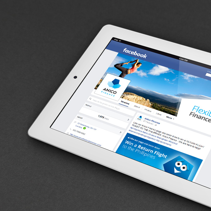
Implementation and why Strong Visual Branding on B2B/B2C Networks is Essential
Overview
Many businesses employ a presence on social networks but compared to other media they often demonstrate little regard for how their brand image is represented or perceived.
Social Media engulfed us initially with personal/profile based environments that advocated a distinct 'do it yourself' culture. The inherent familiarity and structure of B2B/B2C networks leads us to thinking that we should approach our company branding on social platforms in the same way. In reality you need to address your image on B2B/B2C social platforms with the same degree of importance and professionalism you would any other corporate release.
Should I Maintain my Brand Image on Social Platforms Myself?
Assess your personal capabilities with regard to the management of your brand image within social platforms. If traditionally you are not involved with the design/production process of your company's marketing collateral consider appointing a suitable colleague/agency to handle this aspect. Although maintaining posts and daily activities can be completed fairly easily, sizing and achieving acceptable results when uploading brand based material can be a hit and miss affair.
Social platforms employ constantly evolving specification and criteria that requires frequent monitoring. Although their original concept and purpose is well conceived their interface and inconsistent reference material can be anything but. Without experience brand components such as logos or cover images can be compressed/reduced in quality and stretched out of proportion. Another consideration is designing around images that are compatible and not compromised in mobile view. Considering many social platforms still offer a business presence that is still free any professional involvement here will be money well spent in preserving the quality of your brand image.
Visual Branding for Social Networks, Planning and Considerations
As with the application of all branding, consistency is the primary objective. You should strive to reproduce a consistent brand image across your designated range of social networks. Your brand environment and core messages need to be professional, structured and focussed. This will of course through up some challenges along the way. Typically the available logo/avatar shape will vary, the header or profile graphic will offer increasingly less usable space, images may resize outside of your control. The focus here is try to retain a group of design components between the imposed restrictions that demonstrate an obvious relation to your existing marketing material themes.
Applying your Logo
Use a logo format that is suitable and consistent throughout all your social platforms, typically a darker background rather than white will offer more contrast and visibility. You may need to create an adaptation or revise your logo for your chosen networks. Simple flat colour and elements usually work better. Most platforms adopt square or circular logo areas which are less than ideal for rectangular or longer named logos. Another consideration is logo profiles are often reused in other areas at a greatly reduced size. Test and make sure your logo is not compromised at these sizes. If the length of your name or the format is an issue in any of the given areas consider an ‘initial’ based variant or one that just adopts the first letter of your brand name. This is common practice amongst many large corporations, just make sure your full company name is clearly visible in your profile text.

strive to reproduce a consistent brand image across your designated range of social networks.
Working with Cover/Header Images
The cover/header image should be strong but simple. In most instances it is unlikely that you will be able to include some text in this area that won’t be compromised or cause issues in mobile view. We would recommend you choose an image commonly associated with your marketing material, which works with the orientation of the space and offers good contrast to your logo. Treat the cover image consistently between networks, if your image doesn’t use a filter or treatments in your printed media then do not apply them for social networks.
Sizing, Applying and Testing Imagery
When applying any imagery to social platforms observe (where available) the suggested pixels sizes and recommended orientation for the area. Size your content accordingly using an image editor (Photoshop, GIMP etc), If you don’t it will be stretched automatically to fill the area distorting the quality and proportion of your original image.
Remember that networking sites are responsive and are designed to serve your content at a size dictated by the device of the user. Test the images you upload on desktop screens, tablets and mobiles. Most browsers also offer a ‘Responsive Design Mode’ which offers a viewing area for testing at common device sizes. You may find at certain screen sizes your images are up scaled, so make sure there original size is sufficient to deal with this.
In general the recommended pixel sizes quoted by social networks veer towards the minimum for acceptable results. If quality is paramount or needs to be improved at larger sizes you could try doubling the recommended pixel size. For example a 400px x 200px image could be made at 800px x 400px instead. Note: Always retain the proportions of the original dimensions when scaling.
Beware of imposed compression, most platforms will automatically compress the images you upload when they exceed a certain file size so try and keep below the quoted figure to obtain sharper results.
Accept Compromise
The design environment of social networks remains a constant obstacle for designers or those used to exercising complete control over their brand model. The discord of the providers colour palette, competing advertising, ever evolving specifications, unrelated font sets and a governed and inflexible layout do little to appease your work flow or sanity.
With perspective B2B/B2C social networks offer businesses a free and highly visible cross-selling platform. They represent another selling arm for us and their compromises are something companies (regardless of scale) have to work around. Don’t get too hung up on areas beyond your control. Maintain the attitude of achieving consistency, and quality of image within the core brand areas that are available to you. Spend time studying specifications (cheat sheets) from variety of sources, think simply and consider your contents surroundings, finally test widely.


